
Technology
Google Arts & Culture is getting on the dark theme train
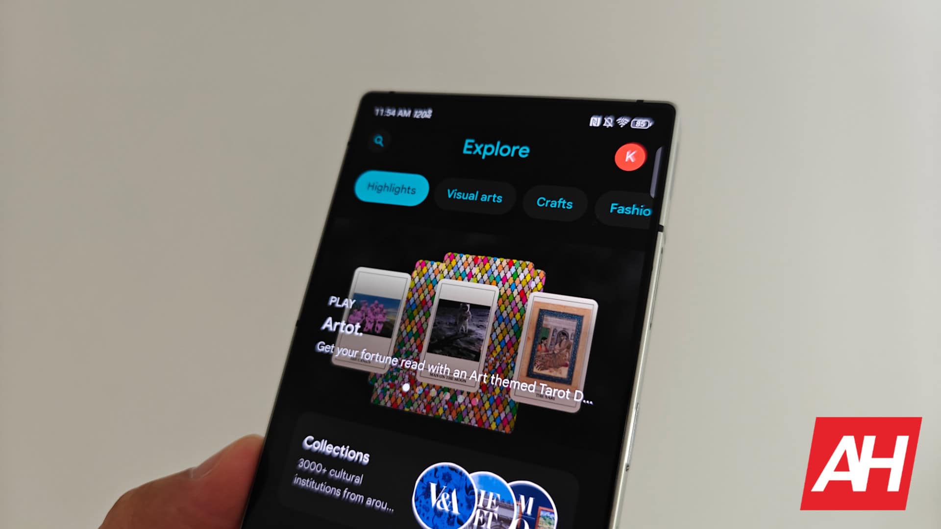
If you’ve ever found yourself staring at your phone late at night while browsing the world’s art treasures, Google Arts & Culture has just what you’re looking for with the latest addition of a dark theme. The feature is being rolled out to the app with the latest update to v10.9.x on Android and iOS.
It’s not just about the colors, though. Google has seriously thought about it this dark mode feels polished. Every detail, from the cups and chips to the buttons, has been carefully customized to blend seamlessly with the dark theme. It’s the kind of attention to detail that makes all the difference and is a welcome change, especially for those who value consistency. The new look perfectly matches the updated ‘&’ logo that Google unveiled last year, replacing the four-color icon with white and placing it on a dark background.
Flexibly embrace the trend
Adding a dark theme to the Google Arts & Culture app is not an isolated issue. It’s part of a larger trend in the tech giant’s ecosystem. In recent years, more and more Google apps have offered this visual option, realizing that it not only reduces eye strain but can also extend battery life. This latest update brings Arts and Culture up to speed, which could be a signal that the stubbornly smart outliers like Google Opinion Rewards could soon get the same treatment.
One of the most exciting aspects of the new dark theme is its flexibility. If you prefer your device settings to determine the app’s appearance, the “System Default” option seamlessly adapts to your preference. However, those who want full control can easily switch between light and dark modes directly within the app’s settings. To get to this setting, open the app, tap your avatar in the top right corner, Arts & Culture Settings, and tap ‘Theme’ under Accessibility.
Beyond the surface
The introduction of a dark theme accompanies a larger trend of updates and refinements within the Google Arts & Culture app. Last year, Google initiated a substantial Material Design makeover, streamlining the interface and introducing sleek new elements such as an app bar with turquoise/blue accents. These changes, combined with the dark theme option, reflect Google’s ongoing commitment to making arts and culture a more accessible and enjoyable way to engage with our human artistic heritage.
Whether you’re a lifelong art lover or just starting to explore the wider world of artistic expression, the Google Arts & Culture app is a fantastic tool for you. And now with the new dark theme it is even easier on the eyes.